Design errors - UNITED NATIONS |
|||
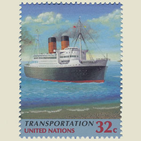
These big ships are much too close to the beach. |
| ||
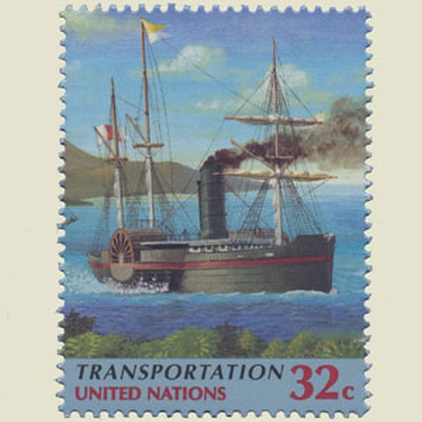
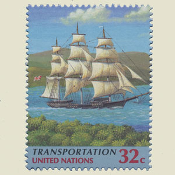
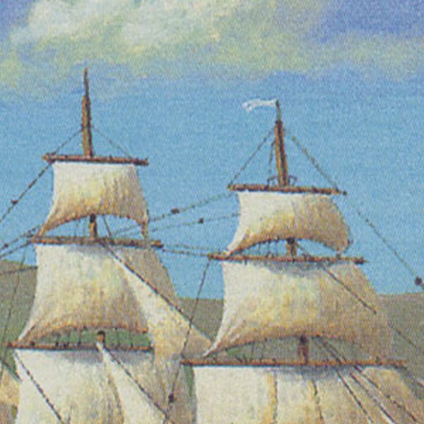
Flag and sails are pushed by the wind in opposite directions. |
| ||
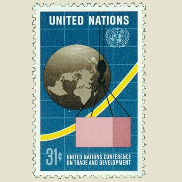
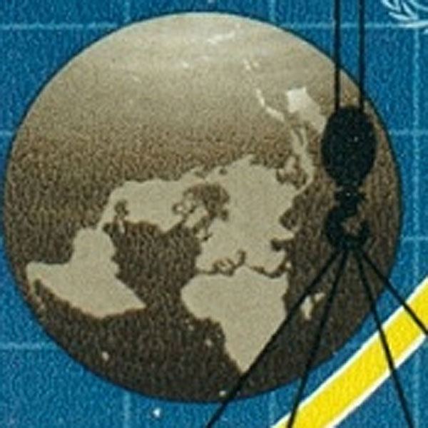
Continents on the move |
| ||
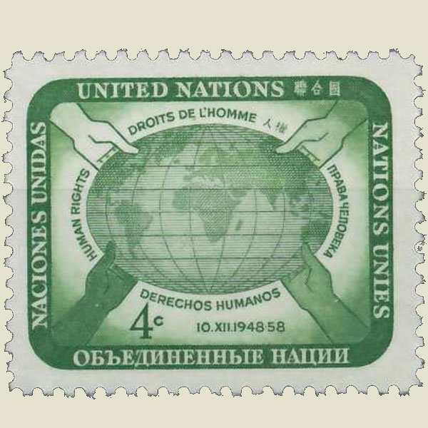
Antartica is missing |
 | ||
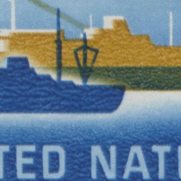
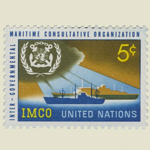
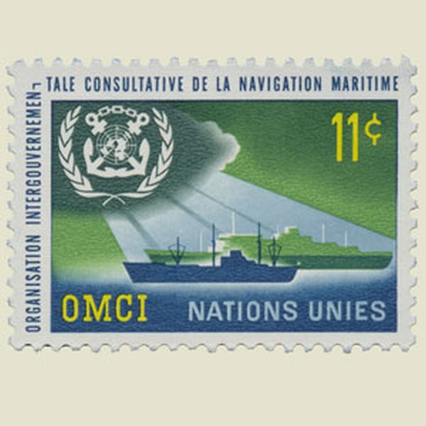
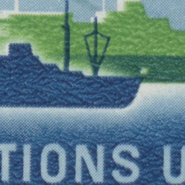
On one of the stamps, the flag that must flying at the sterm of a ship in open water, was forgotten. |
| ||
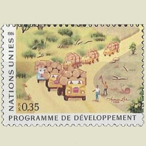
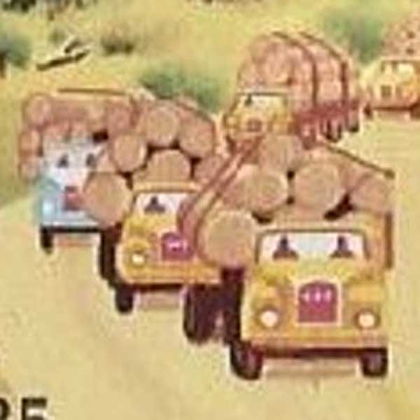
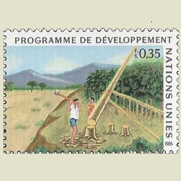
Strange way to load logs onto a truck |
| ||
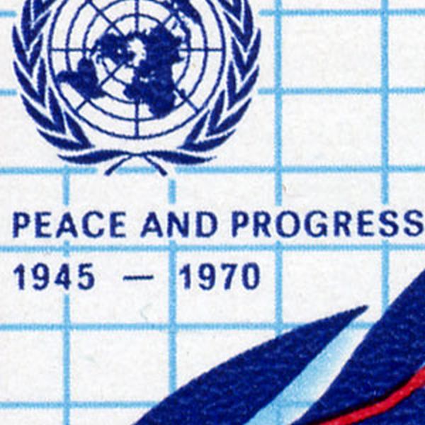
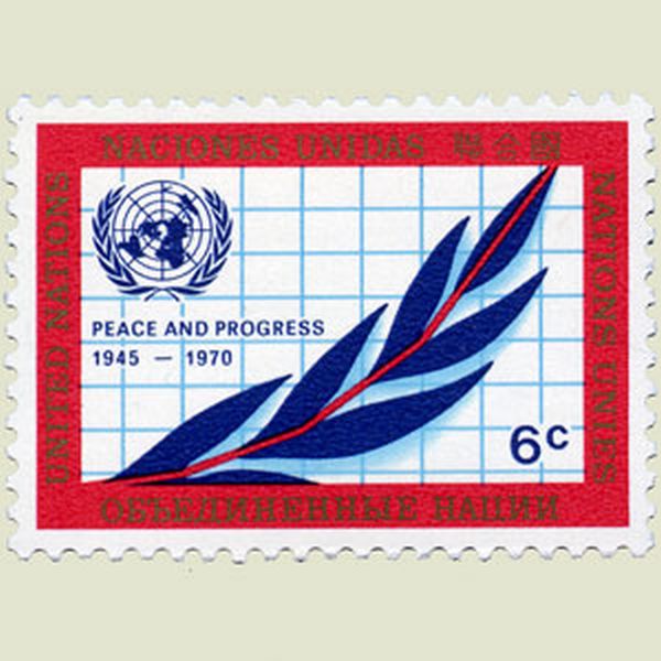
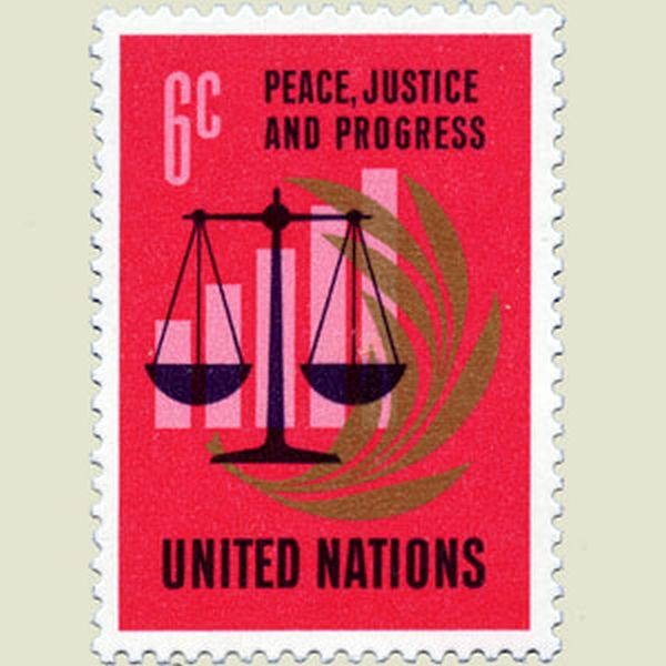
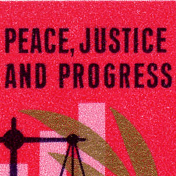
The slogan for the 25th anniversary of the U.N. Charter was Peace, Progress and Justice. Justice however was forgotten, and added on a new stamp the following year. |
| ||
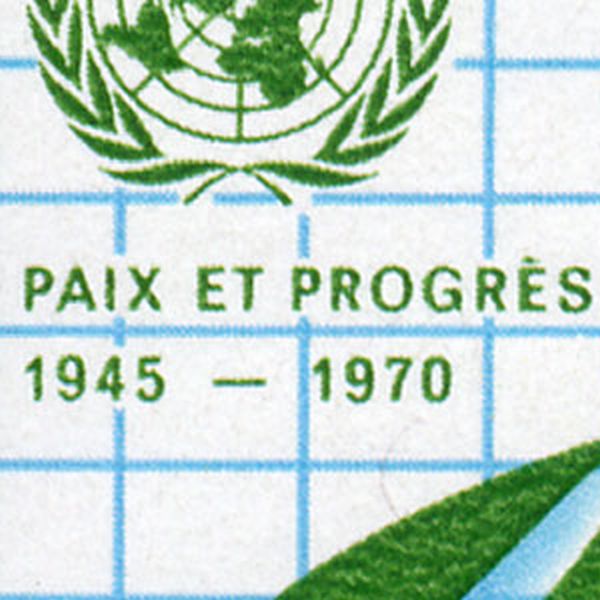
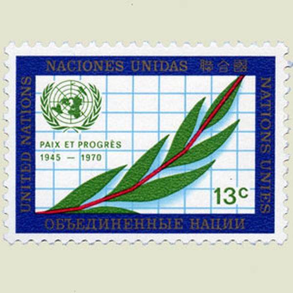
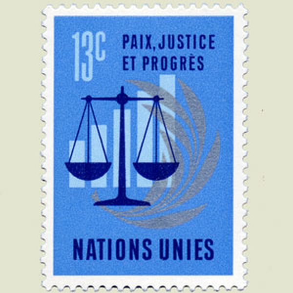
The slogan for the 25th anniversary of the U.N. Charter was Paix, Justice et Progrès. Justice however was forgotten, and added on a new stamp the following year. |

| ||
Where is Madagascar ? |
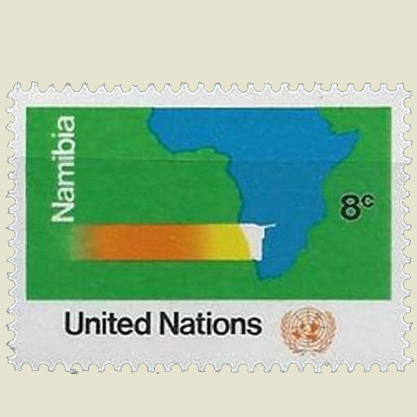 | ||
All the continent have been located on the same side of the earth |
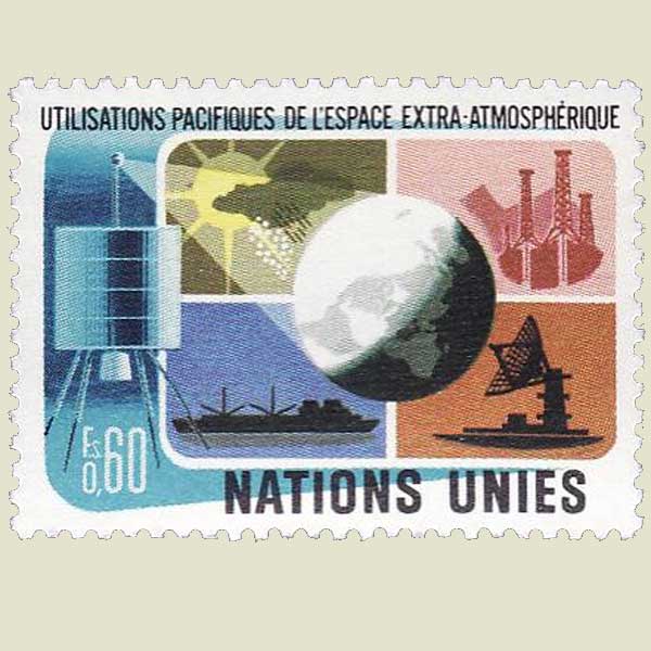

| ||
Rainbow with incorrect colours. |
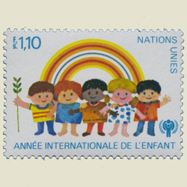
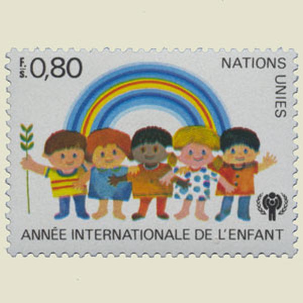
| ||
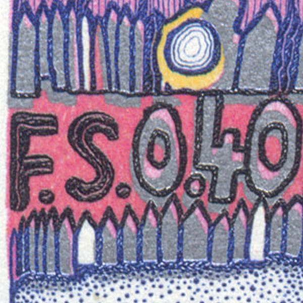
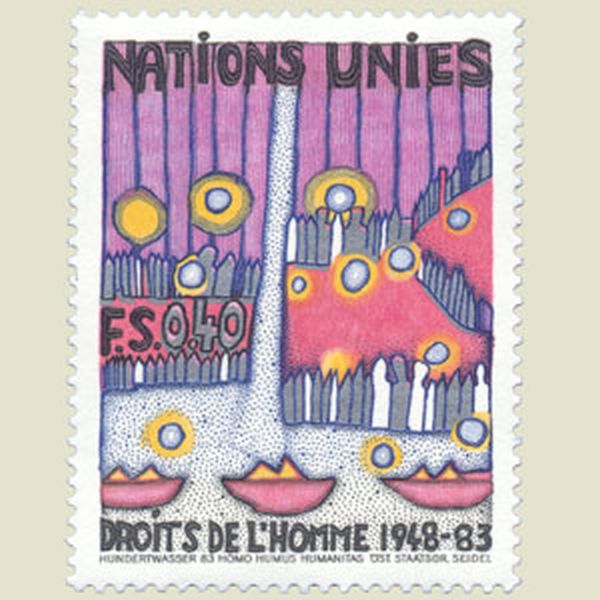
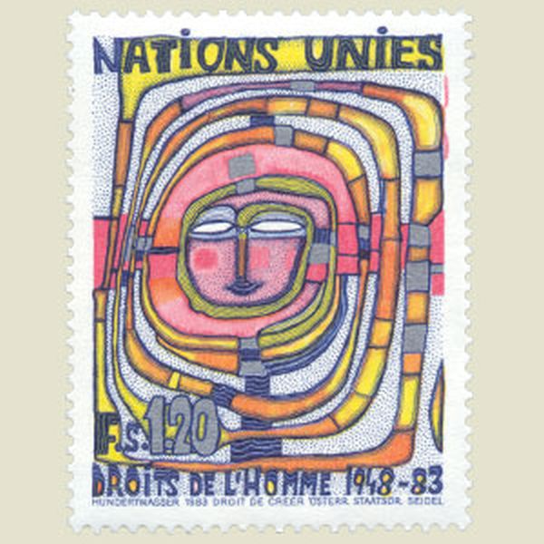
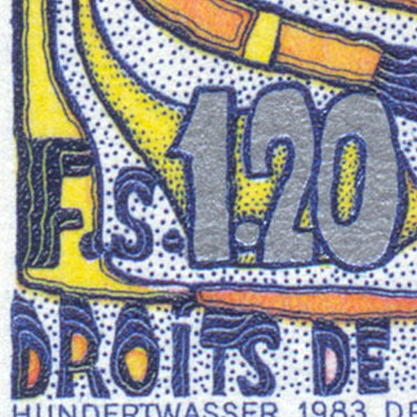
The postal value these stamps is almost invisible. |
| ||
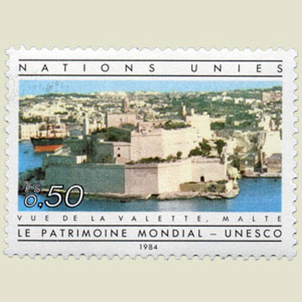
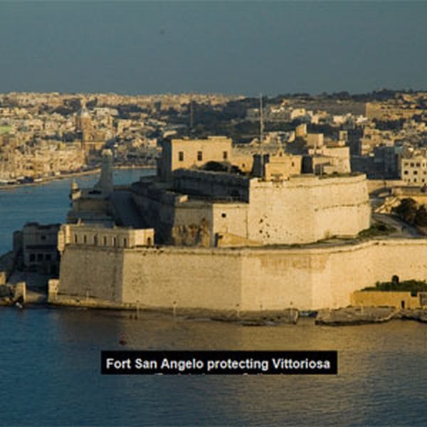
This stamp does not show La Valetta, the capital of Malta, but Fort San Angelo in the town called Vittoriosa. |
| ||
It is impossible to obtain such a clean cut with an axe |

| ||
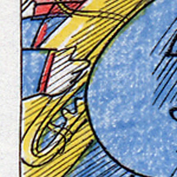
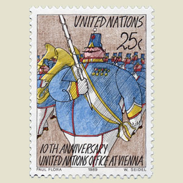
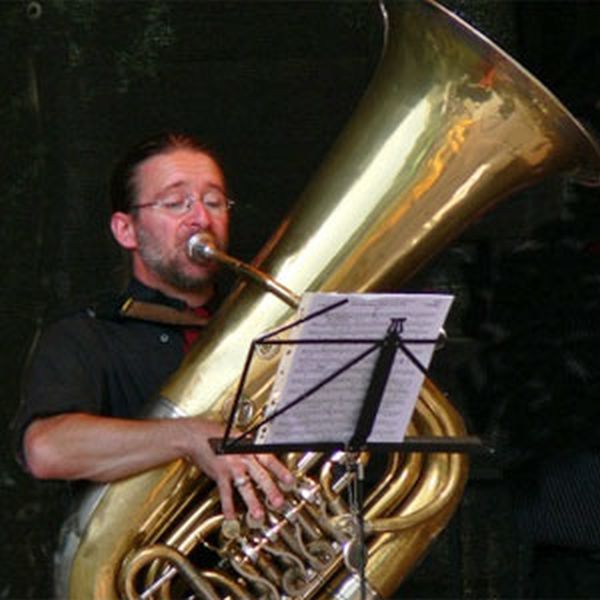
This tuba player is holding his instrument with the right hand, and thus has to play with the left one, which is impossible. |

| ||
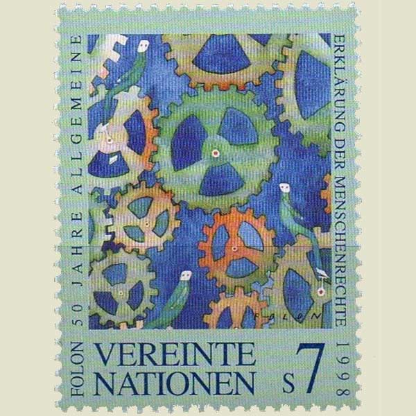
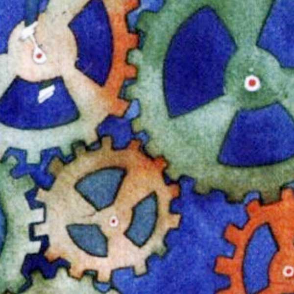
Try to move those gears, it is completely impossible!. |
| ||
 |

 |