Design errors - NETHERLANDS |
|||
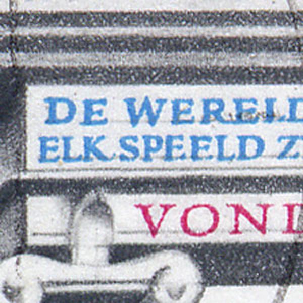
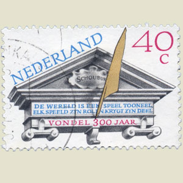
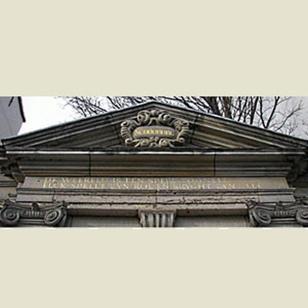
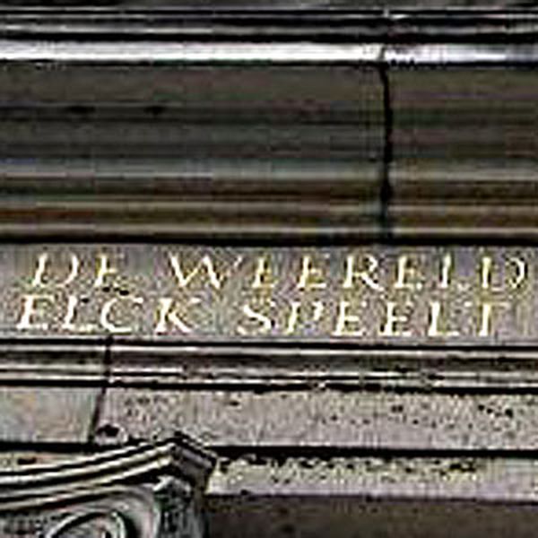
The designer tried to translate an old Dutch text to modern Dutch, but made a big mistake. |
| ||
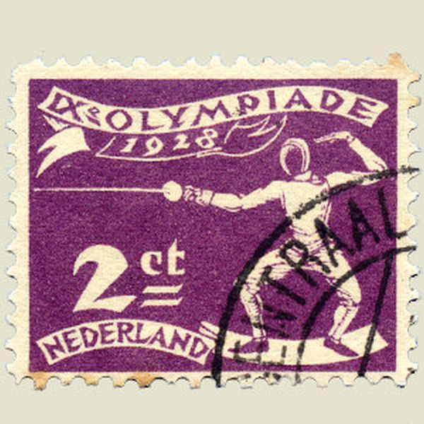
The leg and left hand position of this fencer is not correct. |
 | ||
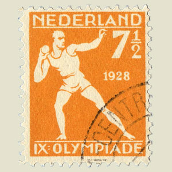
The shot-putter has a wrong position of his head and arm. |
 | ||
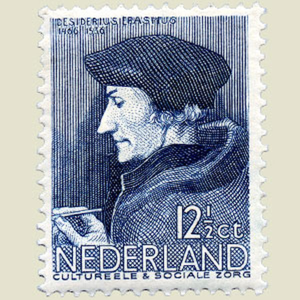
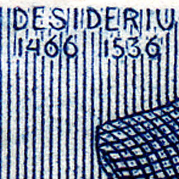
Erasme was not born in 1466, but in 1469. Correct on another Dutch stamp. |
| ||
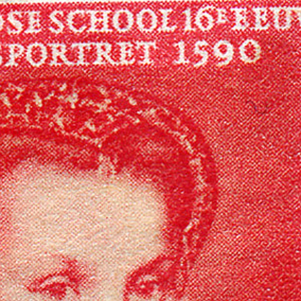
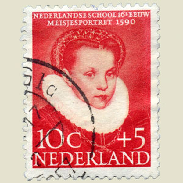
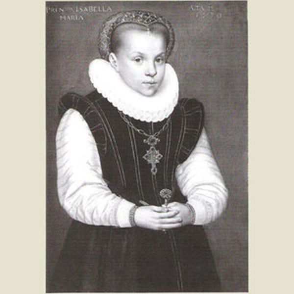
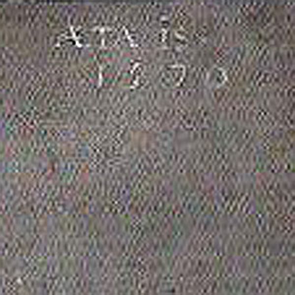
The stamps tells us that this painting was made in in 1590. But a closer look at the right upper corner of this painting reveals the real year : 1570 |
| ||
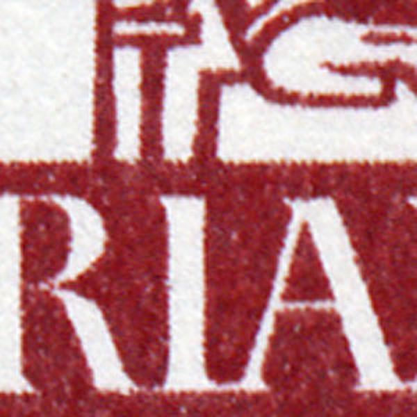
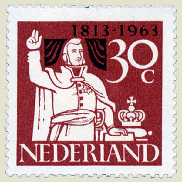
I instead of L on the red 30c stamp |
| ||
The flags from The Netherlands and Luxemburg are identical, except for the blue colour : on the Dutch flag, the blue color is a little bit darker. |


| ||
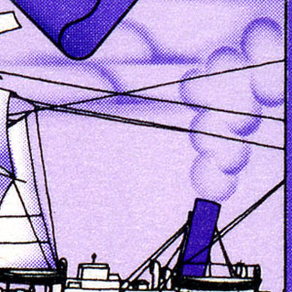
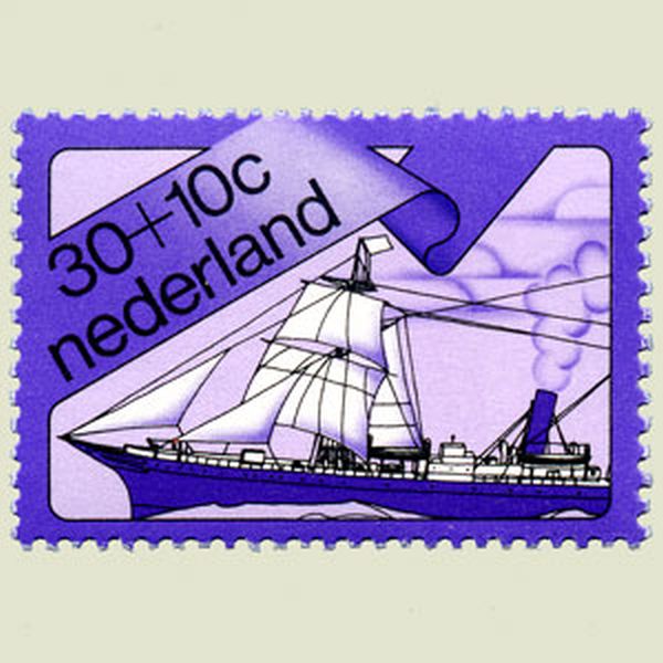
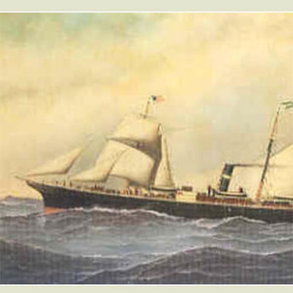
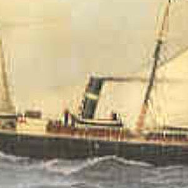
As this ship is sailing, the smoke cannot leave the funnel as faetured on the stamp. See painting of this ship with a more correct representation. |
| ||
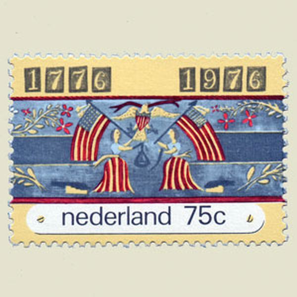
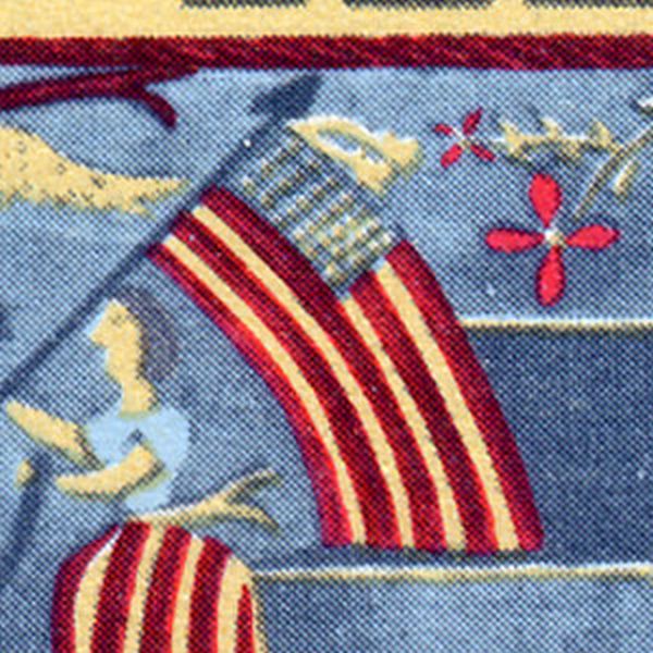
The American flag has 13 horizontal stripes, not 9 as pictured on this stamp. |
| ||
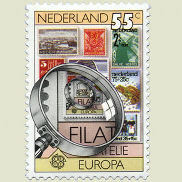
The size of this magnifying glass is only half the size of a poststamp. |
 | ||
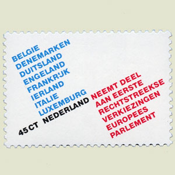
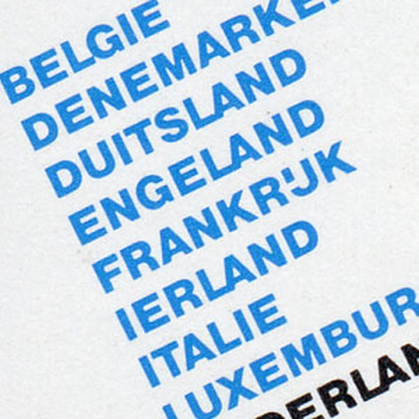
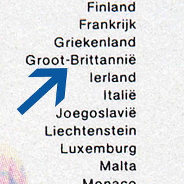
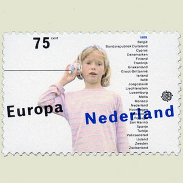
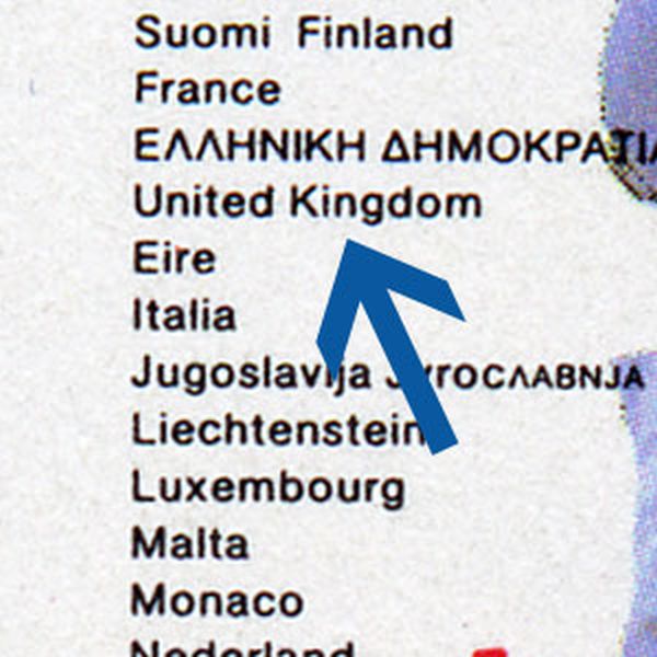
It is not England, but the United Kingdom which is a member of the European Union. |
| ||
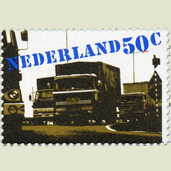
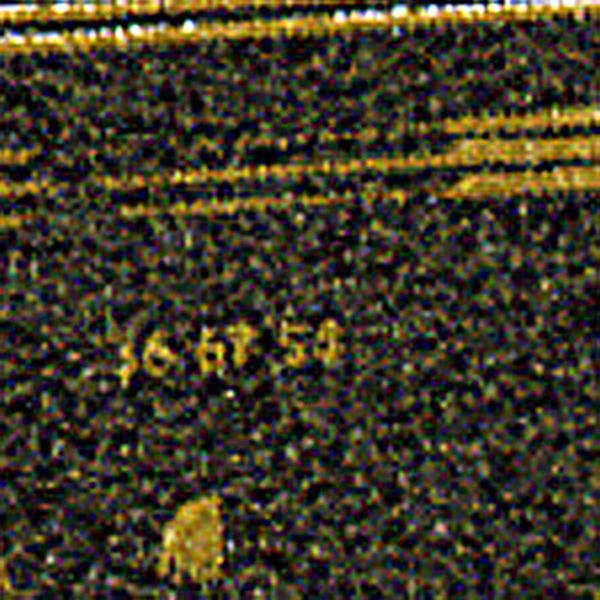
This is not a valid Dutch registration number of a car, but probably the phone number of a friend of the designer. |
| ||
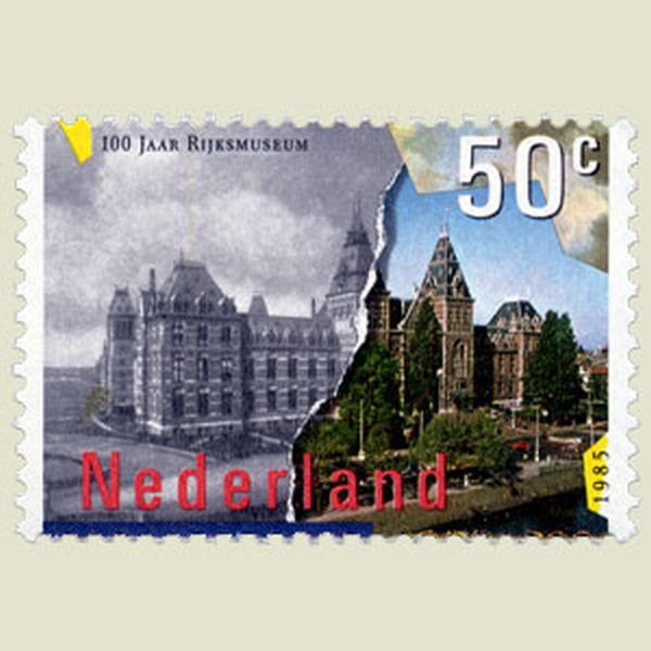
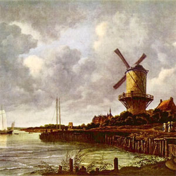
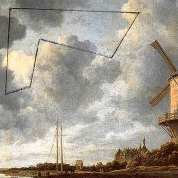
Someone found the origine of the clauds in the upper right corner of this stamp : an inverted part of the sky from a painting of Jacob Van Ruysdael. |
| ||
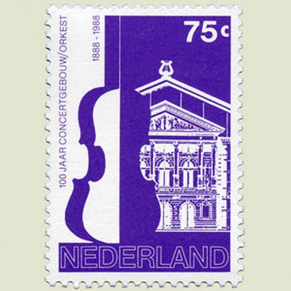
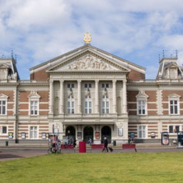
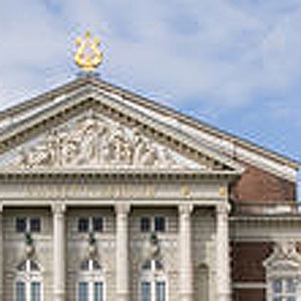
The main building of the Concertgebouw of Amsterdam is larger than the front. Thus the roofs of both parts are not in line. |
| ||
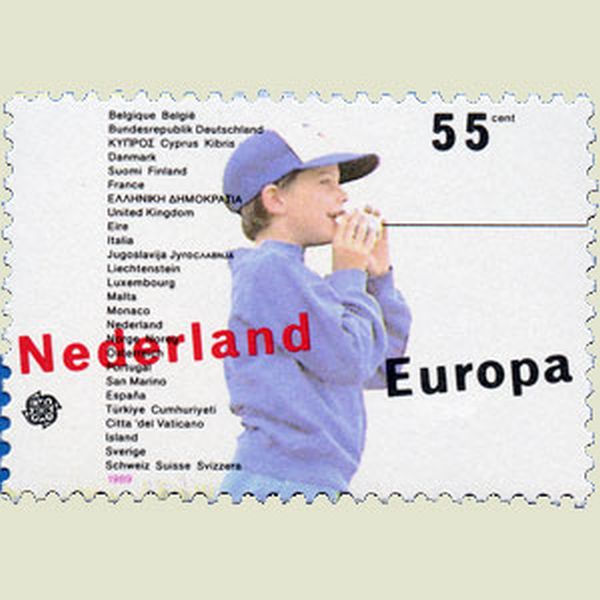
It is not England, but the United Kingdom which is a member of the European Union. Correct on the other stamp. |
| ||
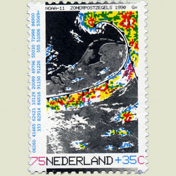
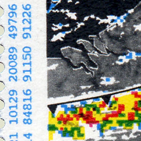
The coded information on the left side of the stamp do not correspond with the weather picture on the stamp. |
| ||
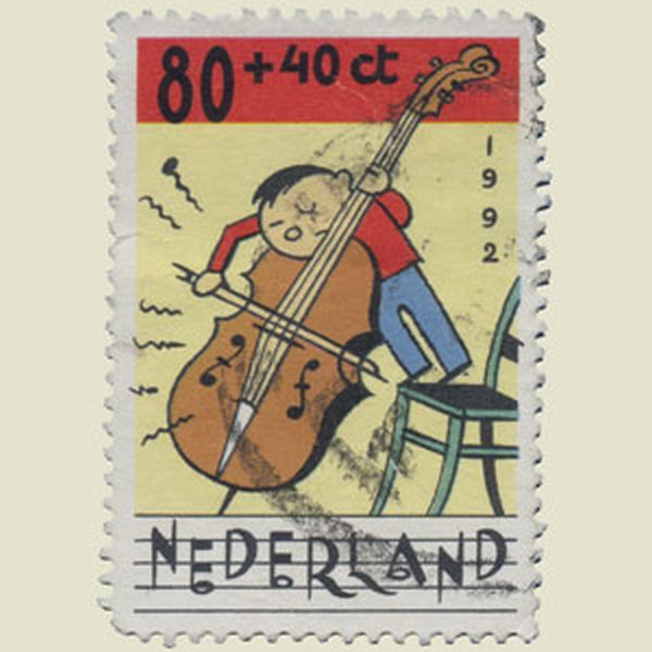
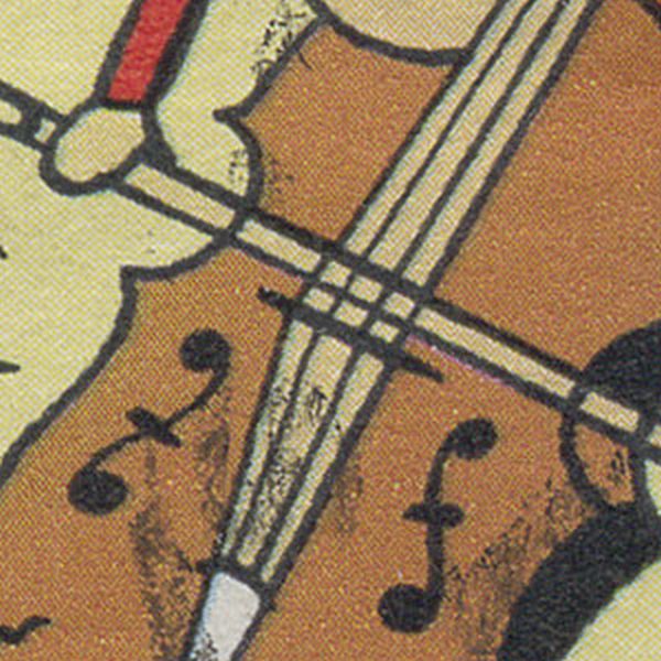
Cello with only two strings. |
| ||
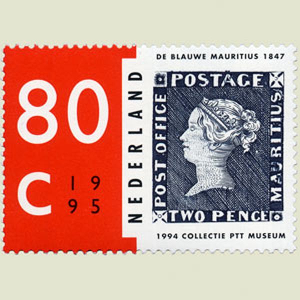
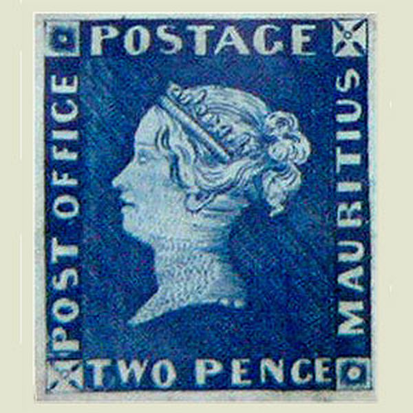
The blue color of the 2 pence Mauritius stamp is not correct. |
| ||
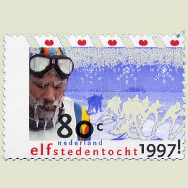
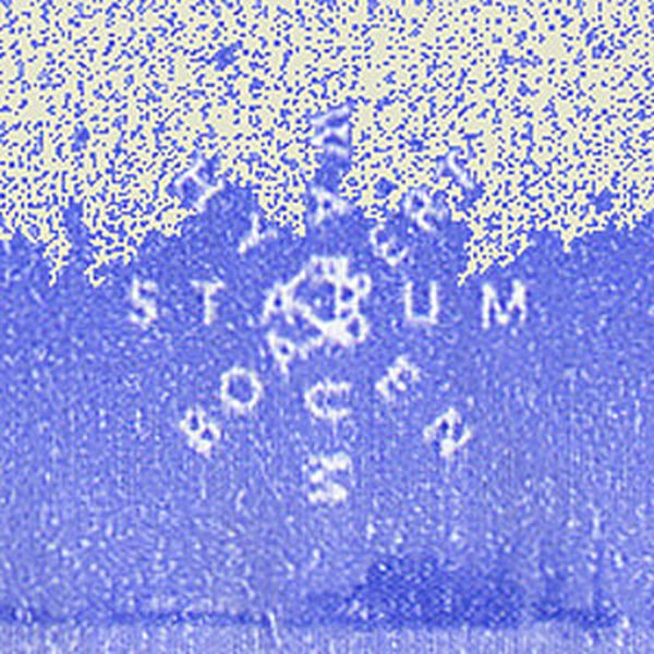
Ice crystals were made with the names of the cities of the Elfstedentocht. On the stamp they have eight branches, in reality only six. |
| ||
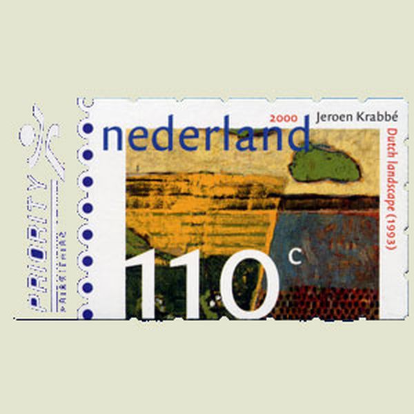
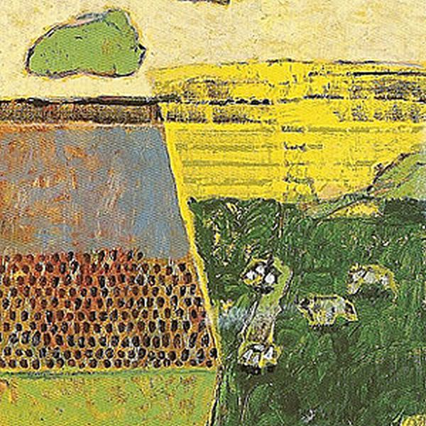
Inverted representation on the stamp, comparing to the original painting of Jeroen Krabbé. |
| ||
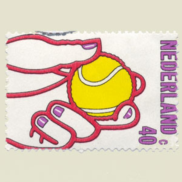
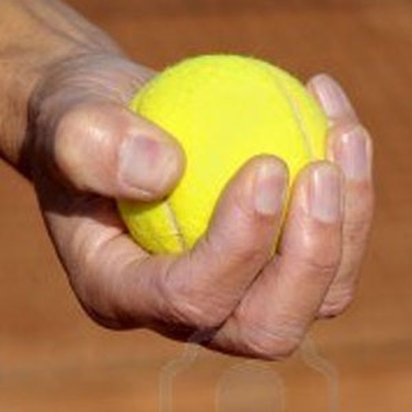
The size of this tennisball is far too small comparing to the hand. |
| ||
 |
 |